One system, many products
Rogers Foods has been a trusted grain processor in Western Canada for over 60 years. Everything they make uses 100% Western Canadian grain. They're well known for baking and sold nationally. But over time, their packaging had become a mishmash. Different eras, different designers, zero cohesion.
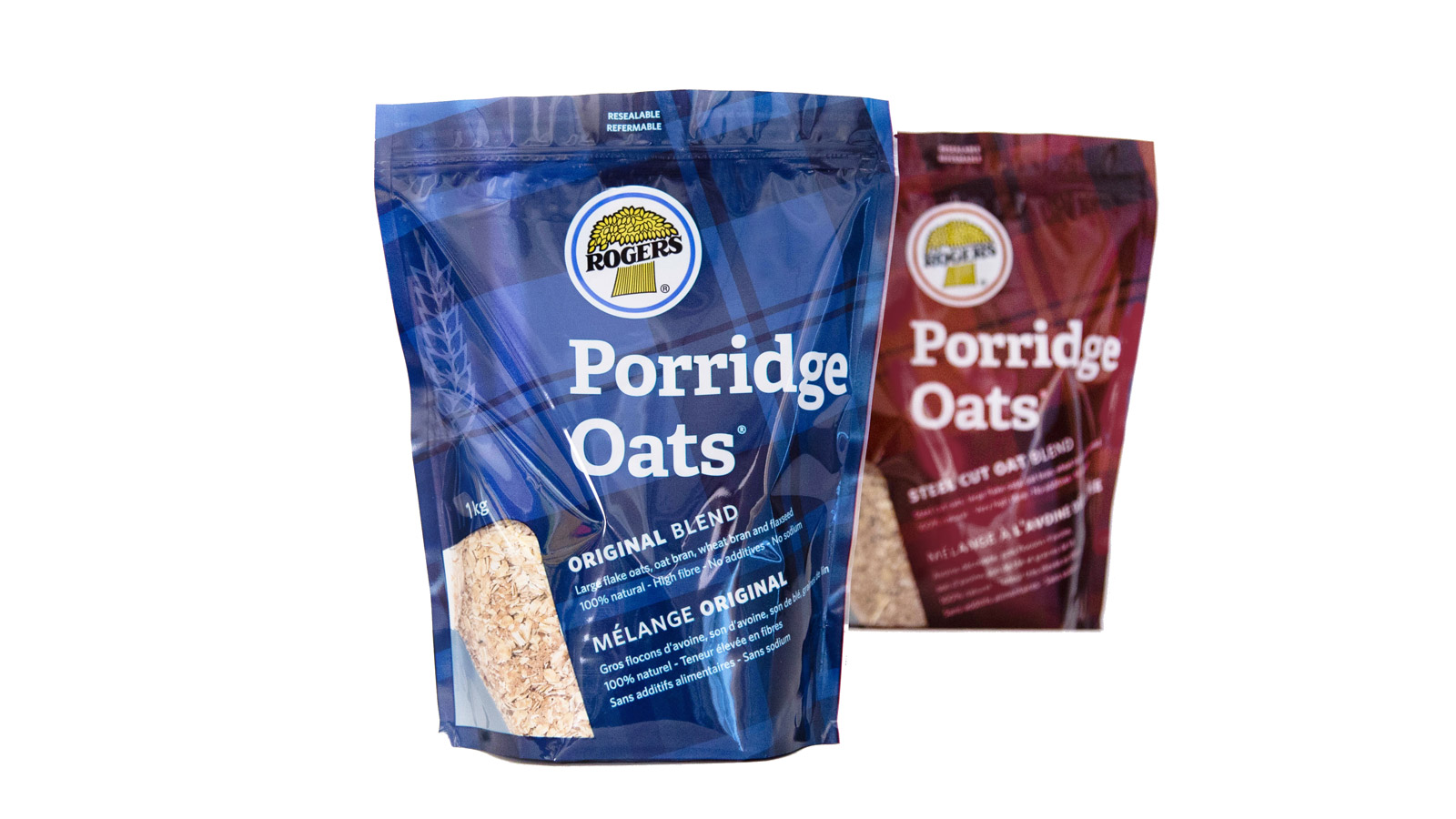
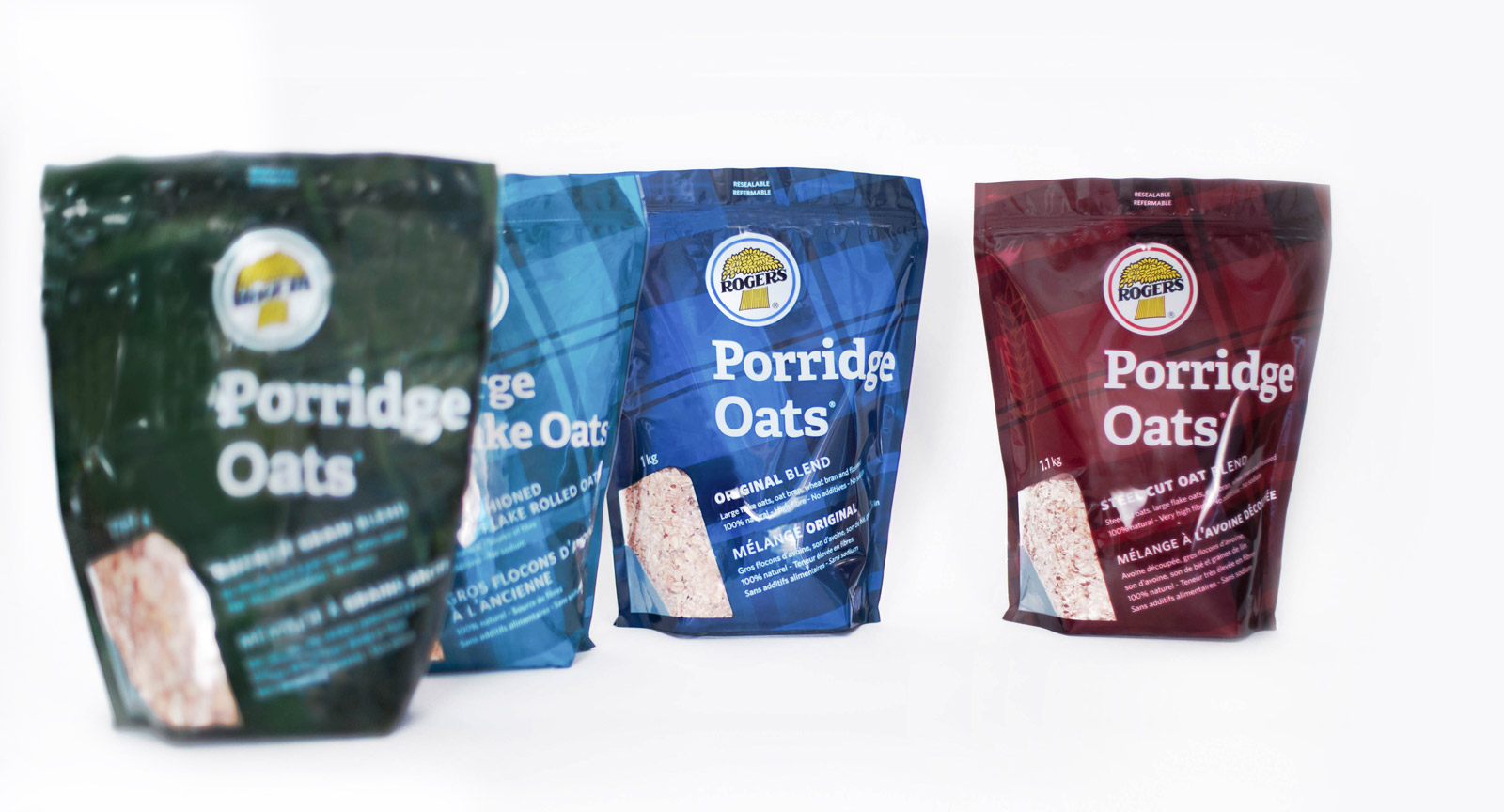
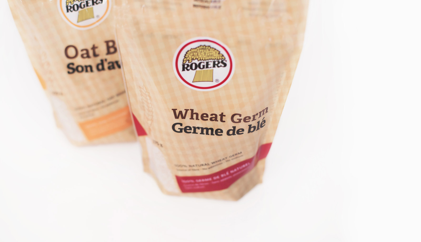
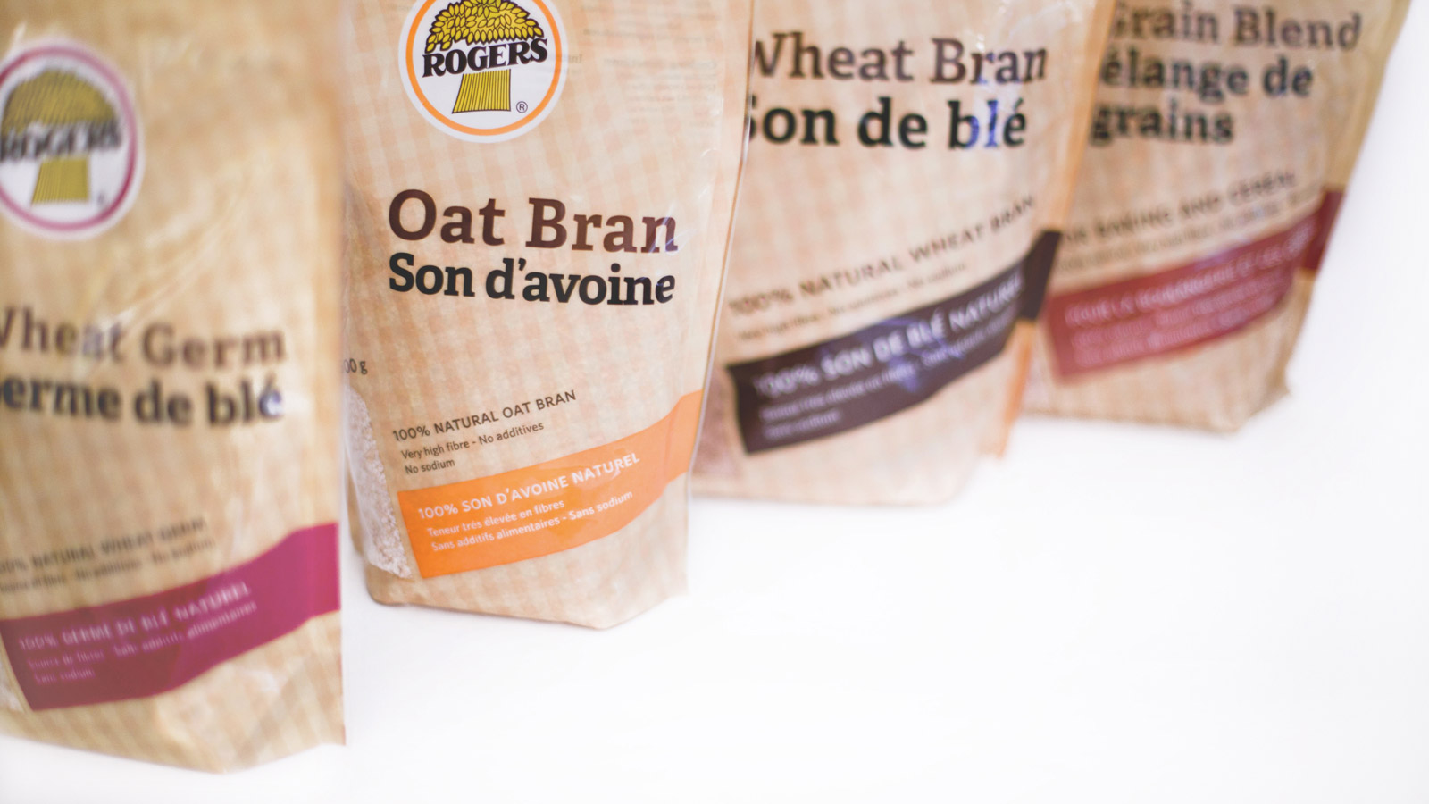
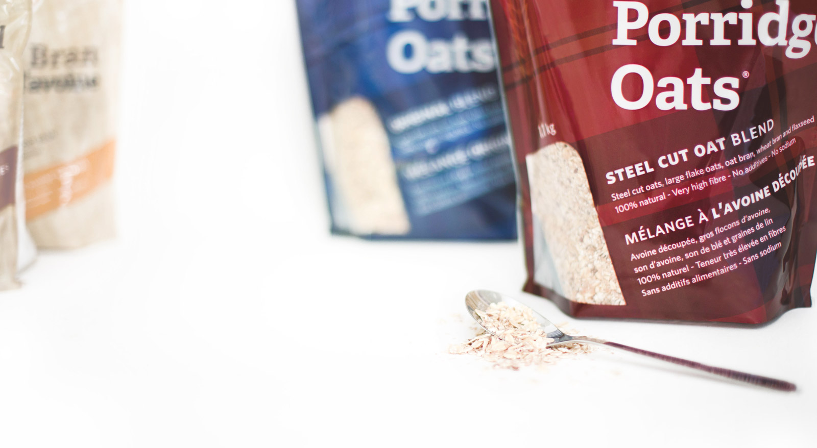
We started with porridge oats and cereals, creating a unified design system that uses color to signal variety while keeping the heritage logo front and center. The flour bags came years later, extending the same system. Red for all-purpose. Orange for whole wheat. Teal for bread flour. Burgundy for rye. Simple, scannable, and distinctly Rogers.
The result: a cohesive brand presence across the baking aisle, from oats to wheat bran to flour.
A complete transformation
The old Rogers cereal bags had served the brand for years, but they'd become dated. The new system brings clarity, consistency, and a fresh look while keeping the trusted Rogers name front and center.
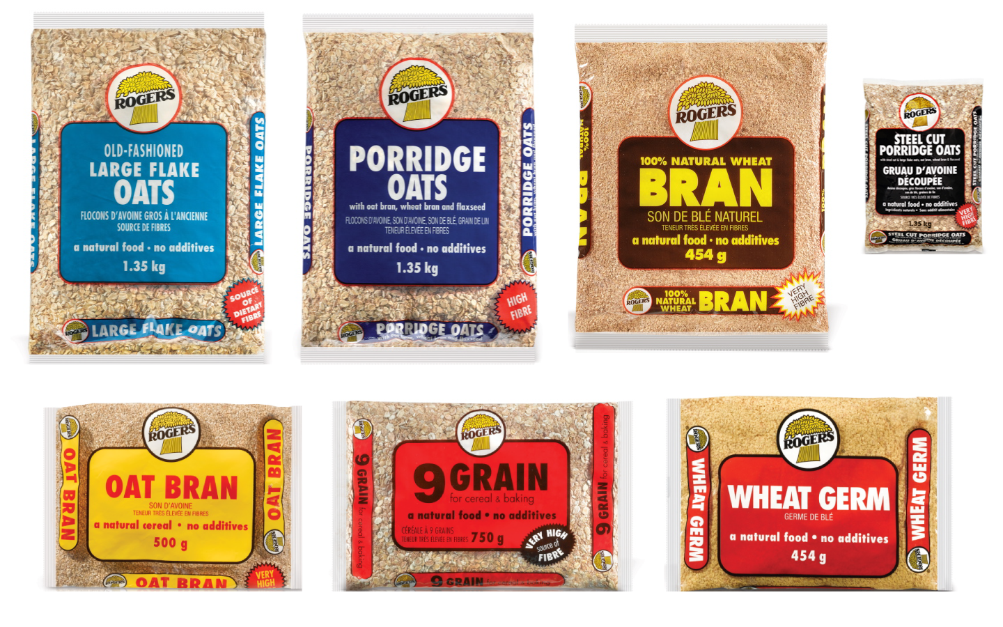
Before
After
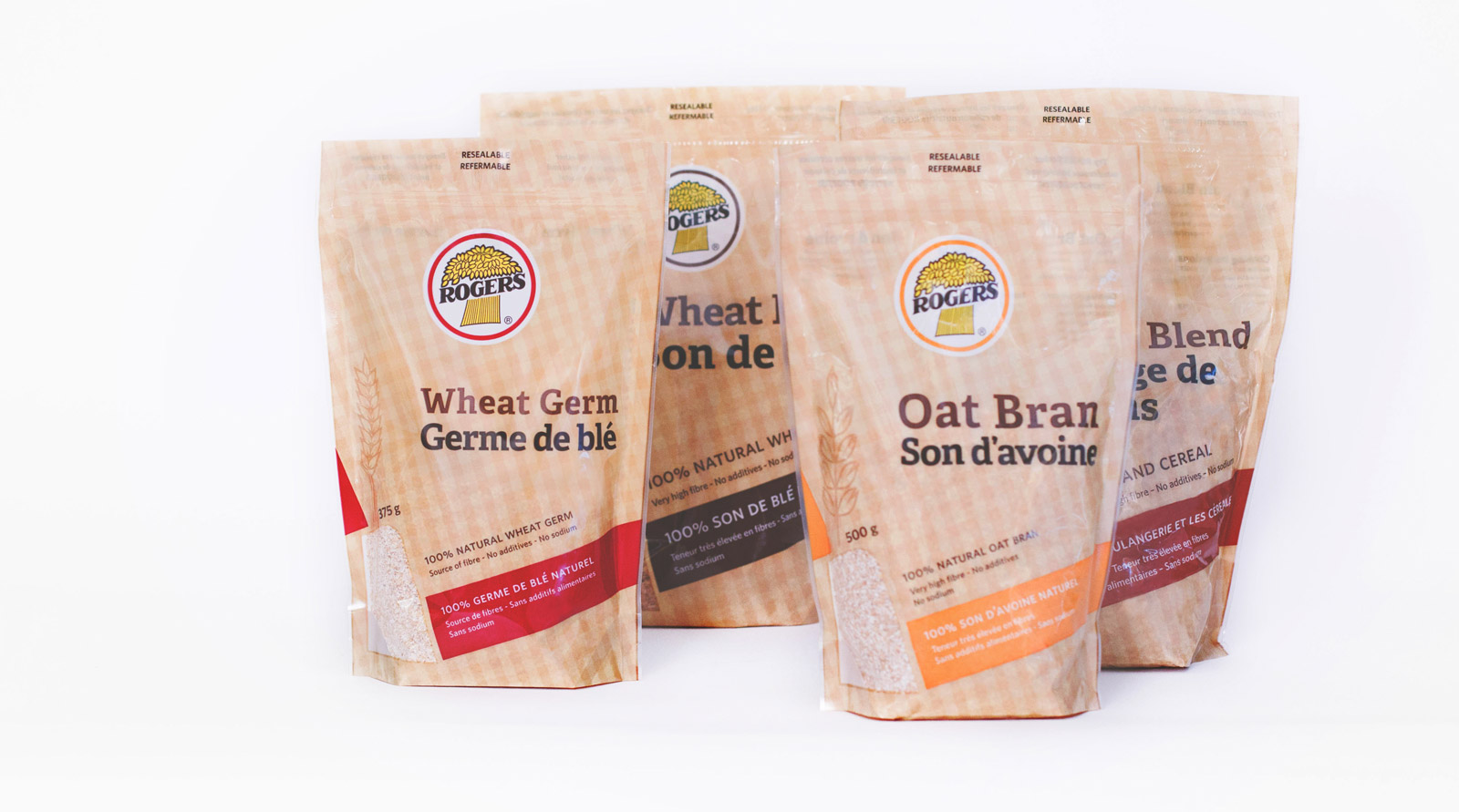
The flour range followed, extending the same design system