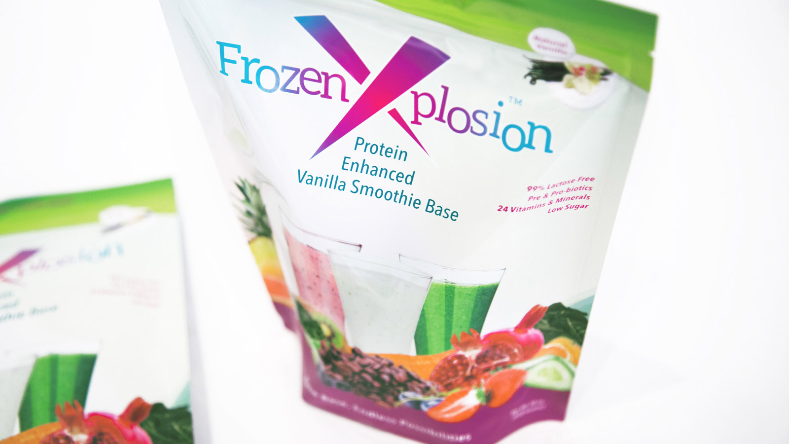
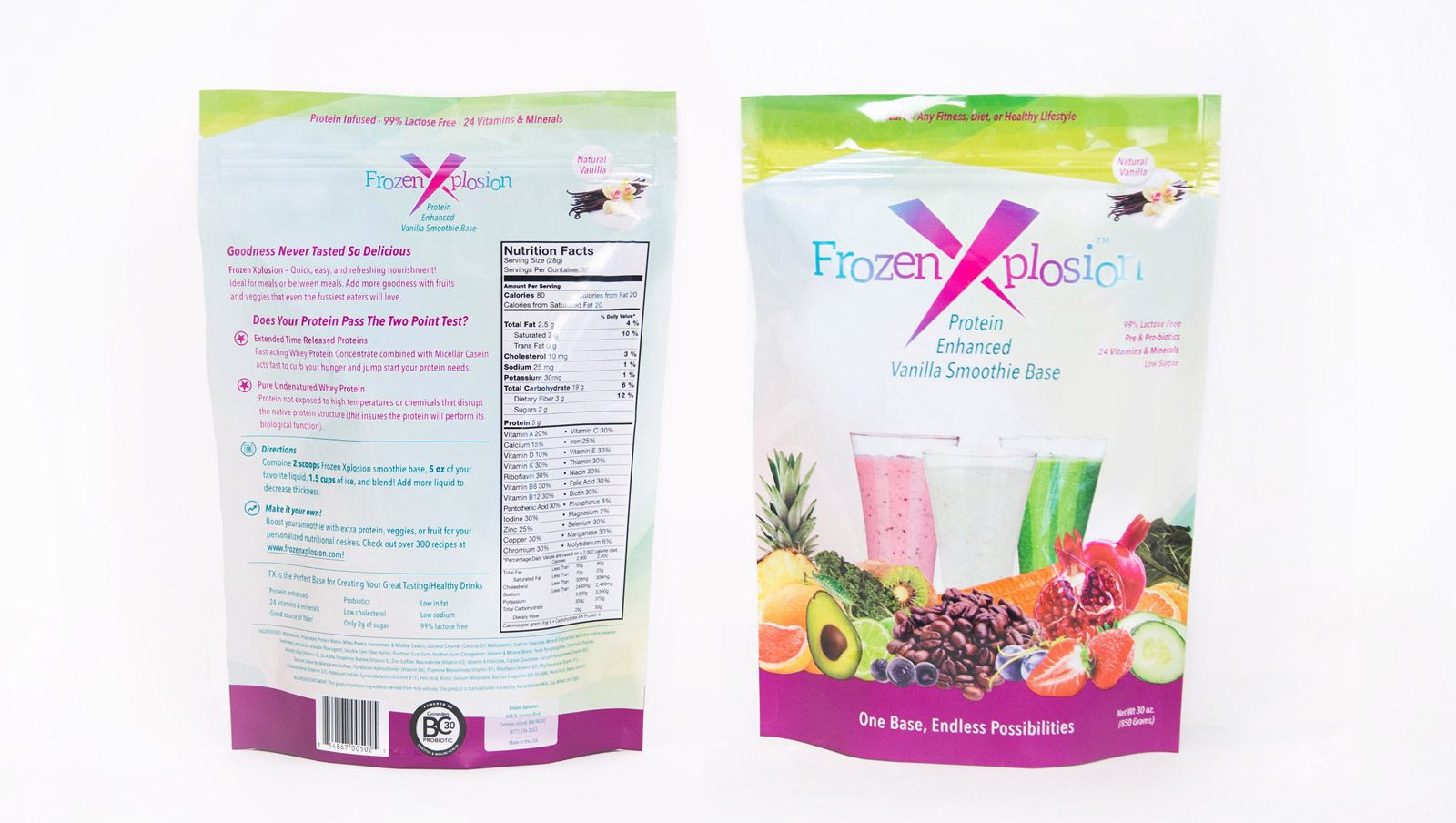
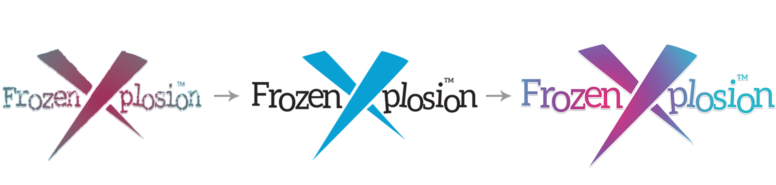
A fresh look for a healthier formula
Frozen Xplosion was undergoing a complete reformulation, introducing fair-trade ingredients and all-natural proteins to create a healthier smoothie mix. They needed packaging that would reflect this new direction and stand out on shelves.
The core challenge was communicating what the powder is and how it can be used. This versatile product can boost any drink, but that flexibility needed to be conveyed clearly and appetizingly to consumers.
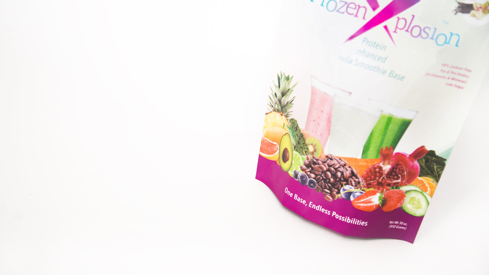
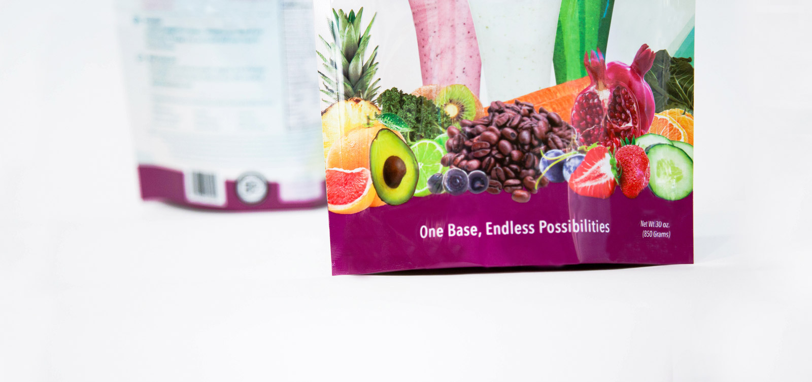
We moved away from the original beige-pink and purple color palette, developing a vibrant new direction featuring bold pinks, blues, and purples. Combined with delicious product imagery and a dynamic geometric background motif, the new packaging captures the energy and health benefits of the product.